
Scrapbooking can occasionally become a boring hobby. I know, blasphemy right? But I know full well I'm not alone. There are days when I produce fifteen pages and there are months when I produce none. It's a swinging pendulum. Though my mood has a lot to do with what I accomplish, I also find that keeping myself challenged keeps me interested. If I'm using the same techniques on repeated pages, I start to get discouraged by my "lack of creativity" and I move on to things other than scrapbooking. Giving myself a challenge now and then keeps me pushing forward, trying new things and loving my hobby.
One thing that I think a lot of scrapbookers get stuck in is the need for different paper and different colors to make their pages "pop". I'm certainly no stranger to the love of paper...I am an admitted paperholic. I have more paper than I will ever use, but I am not immune to a cute new stack or an open stock sale.
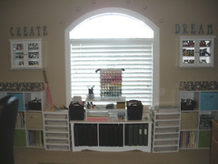
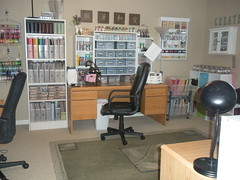
Exhibit A (Left) : Paper in all drawers of the white rolling carts as well as on top of said carts.
Exhibit B (right) : Paper in 3 of the 5 vertical shelves and in the Cropper Hoppers on the right side cart.
* Illustration fails to display additional 6x6 and 8x8 paper in desk drawers as well as paper in a third rolling cart to the right of Exhibit A.
So...now that I have disclosed my dirty little secret, you will no doubt realize that there are endless color and pattern combinations possible. That means when I tell you that I occasionally like to do a monochromatic layout you should be questioning my sanity slightly and asking. "Why let all the pretty colored patterns go to waste?" Well, don't worry. I never let the colors go to waste. The monochromatic layout can add variety to your scrapbook and a challenge to your techniques.
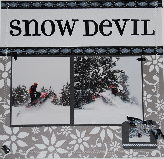
I scrapbooked the above page about 2 years ago. I worked in shades of gray though this same technique can be used with other colors. The trick is to use patterns to your advantage as well as work with all extreme colors of the shade. I used everything from white (stitching) to the darkest black I own (title) and then blended everything in between.
Embellishments can range from simple to extravagant. The trick is to balance the page by putting different shades in different locations. Mix it up a little. Had I used a plain gray background paper, this would have been a lot more boring. The contrasting colors of the flower pattern add the "pop" that may have otherwise come from different colors. I placed the darkest color in multiple locations from top to bottom in order to add a flow to the page. Had I not included the frame and left bottom button, the page would have been terribly top heavy.
Monochromatic pages DON'T have to be boring. Just remember to bring your balance, both in shade and in placement. It makes all the difference.
0 comments:
Post a Comment