Every once in a while I completely run into a wall...not a literal one, but a craft one. When this happens I find that my pages can become a little boring. Generally they get left in a stack to come back to later, but there are some easy ways to create simple pages with a nice little pizazz.
I like to use large photos to fill a good portion of the page. It works even better when that photo has a good focal point. I like faces personally, but it will work well with a good landscape too. If I'm using a color photo I use the colors in the photo to choose my paper. If there is one dominant color, I use a complimentary color as my primary hue. If there are several colors, I will take an accent color from the photo and use paper of the same shade to really make that color "pop". Color can make or break your page.
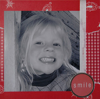
Once you have selected some basic paper, simply position the photo using the rule of thirds. The rule of thirds breaks a photo or page up into six equal portions. The photo should be placed in the intersection of these lines rather than centering on the page. It will add a little to draw the eye. With the above example, the photo takes up a good portion of the page, so I just scooted it down the the lower left corner, leaving my subject's face to "open" the page.
Use paper to add your dimension. In this case I used two papers of the same color, but with differing pattern. You can also use different colors or try using more than two paper types. For me, when crafter's block occurs, simpler is always better.
In this example, I also add extra dimension and "pop" to the page by tearing my paper. This creates a rugged transition and keeps the two papers from blending into each other. Tearing a photo is also an option...if you're a careful tearer.
Finally, add some simple embellishments. I add an element to act as a title, in this case the metal-rimmed tag. In this example, I also added the ribbon to dress the page up a little.
Scrapbooking doesn't have to be about additions. It can be as simple as a photo and a few words on a single piece of paper. Just remember to keep it low stress and fun. If you can't finish without feeling the level of anxiety rise, set your project aside and move on to another.
Next Post : Scrapbooking Styles : How to Complete a Page


0 comments:
Post a Comment